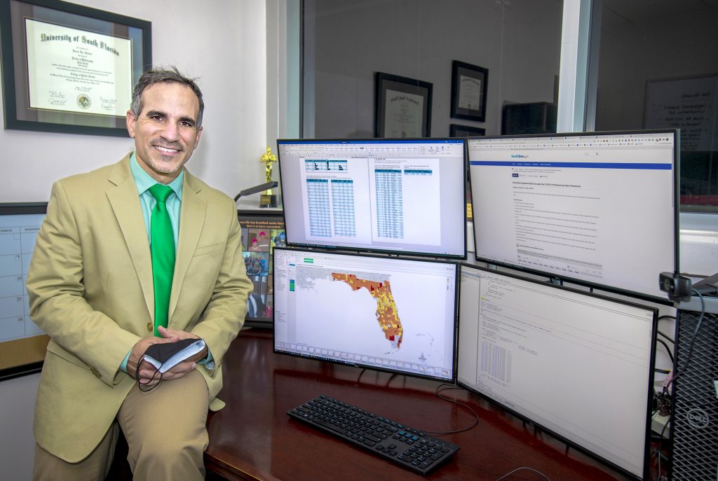
In this video, USF Health epidemiologist Jason Salemi, PhD, explains how he creates and uses online dashboards to show the effects of COVID-19 in Florida.
Using data from the Florida Department of Health, Dr. Salemi creates online charts and tables to give the public updated, easy-to-understand information about the pandemic.
The dashboard, available at covid19florida.mystrikingly.com, is interactive and lets visitors break down data on COVID-19 case numbers and deaths into dozens of visualizations. For instance, visitors can view newly reported cases by county or age group as well as see changes over several days or weeks.
The dashboard has attracted nationwide attention. Dr. Salemi says he was inspired to create the dashboard as a way to provide reliable information and combat misinformation he said he saw regularly spread about the disease on the internet and elsewhere.

USF Health epidemiologist Dr. Jason Salemi pictured in his office near the computer he uses to gather and distribute data on COVID-19.
